How Parking Ticket Payment Machine Teaches Usability
The annoying features come at the top when it comes to analyzing parking ticket payment machine
When it comes to analyzing the top customer services that lack essential features and sustainability, the parking ticket payment machine comes at the top. You can realize this issue when you are going to analyze the disadvantages of customer service experience as usability.
People, therefore, are feeling continuously irritable. It happens in payment parking machines due to many reasons. Amongst them hence are poor designs and outdated features and lagging software.

These things frustrate customers so much that they eventually start blaming themselves and vendors in frustration. However, it requires a careful analysis of what and why are these issues. We then are forced to ponder over the causes.
Many questions arise in our minds when analyzing the failed parking machines’ payment options. Is there any issue with the control panel of the device or the machine is working irregularly? Read more
Possible Existing Issue with Parking Ticket Payment Machine
When we review the number of poorly executed services that frustrate people, vendors, and customers much, we come to notice parking ticket payment machine as the top product.
When we carefully look at the issues, we come to know that is the factor of usability. And this factor eventually remains high for the other business. However, it bypasses the world of car parking machines.
The foremost factor of car parking machines that poses a serious challenge is the design mechanism. There are three major issues that we have noticed and are causing trouble. These are:
- Designing a machine that ensures usability is a critical task. It is because designing a machine that causes no trouble and requires pre-training sessions for the customers even on the first attempt is not an easy job. It requires a lot of training and research.
- The second issues come with software design or interface. We noticed a usual issue of difference of user interface at every time. This nonconsistency remains a big issue in parking machines. For an experience, if you visit five different parking machines, you notice five different user interfaces.
- The third is the lack of cooperation when it comes to services and customer care. You eventually will find no one to look to help after facing these issues.
Ways To Learn from These Parking Ticket Payment Machines

Technology Must Not Drive Design
The foremost lesson that we learn in a sequence of the issues discussed is that technology must not be the factor driving the design. Because most of the time we have observed that there are machines that are working best when it comes to designs.
It happens as the design takes into account the limitation of the users. Conversely, it is working in a way so that people must accustom themselves to the machine.
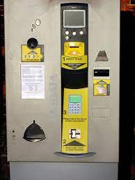
However, this factor of design and technology is something missing which we are observing in car parking payment machines. sometimes we see machines asking to insert the ticket above.
But the section that receives the ticket lies below what is mentioned. Another, issues with the design are that they are so complex as you find it hard to pay the payment. The users consequently fail to find where to insert their payment cards.
Unimportant Things Must Not Counter the User Interface
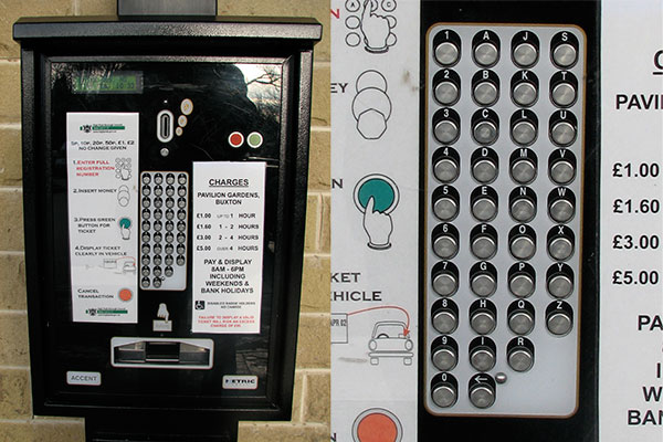
Several machines require you to enter your car’s license plate number in the parking ticket payment machine. It is essential to avoid you passing your ticket to someone else. The reason behind this is that most of the time when people use to leave the parking lots early, they tend to pass their ticket to other people.
Howe this machine is fairly difficult for the old and elderly people of the community. They find it hard to handle this machine and its user interface. The foremost issue is the traditional old-school long keypad. This eventually depicts the constraints of technology in this sector.
The second issues are the lack of modern design smartphone type QWERTY keyboard with which people are so familiar. Therefore, with this design finding your button is so hard and difficult.
The third issue is the labeling of the buttons. The labels of the buttons are closer to the above line which in fact should be closer to the button below.
Usability Matters More than Visual Appearances
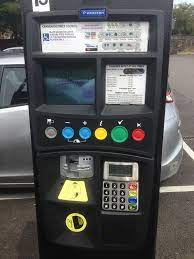
Some machines carry large buttons and color combinations on the parking ticket payment machine. These machines eventually solve the issues that we are focusing on. Such interfaces are user-friendly and hence solve many issues of usability. However, even these designs are pretty hard to deliver the services that they claim. By this, it means that when we are using when you are to get a ticket and pay your payment, the next step becomes hectic. You as a customer eventually leads to follow these steps to get your job done. The steps are:
- Insert your debit/ credit card
- Add the time using + and – buttons
- Press the confirmation Green Button
- Enter the Pin on the Keypad
- Press the “V” Green Button on the Keypad
- Take out your ticket
Looking at these steps makes it sure to us that these large designs surely look good during the official meetings. The manager was surely claiming the heads that the machines make a user-friendly interface.
It is true if you don’t mix up pushing so many GREEN buttons. The main point to discuss is that the addition of colors doesn’t simply add usability.
Usability Sometime Is No More a Concern
Until now we were focusing majorly on the usability option and factors. However, now comes the point that eventually erases all our previous points. Yes, it is true.
When you come to read and learn that even usability doesn’t matter in most incidents shocks you. Yes, you will understand the issues when you start thinking not as a customer but as an owner of the car parking. It is because a more usable car parking ticket payment machine hence doesn’t ensure the business bring more revenue. Conversely, their ultimate goal is to maximize revenue by installing more and more machines.

For the sake of example, if a machine doesn’t work well, or more precisely if people are not using it correctly, there are two possibilities. One is that either the customer has to pay more as overpay. Or the owner will charge the customer. In both ways eventually, the owner is the one making profits.
Get a detailed review and guidance of Car Parking Machine design and issues here

